
Suffolk brewery, St Peter’s, has unveiled its full brand refresh, revealing an eye-catching new logo, contemporary colours and a design that brings its rich heritage to the fore.
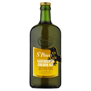
Staying ever true to its Suffolk roots, St Peter’s has retained its iconic oval bottle, and the new labels – which feature across its nine-strong range of bottled beers – put the raven symbol for which St Peter’s is renowned at the heart of the design. Bolder and brighter colours have also been chosen to create a stronger shelf presence. The rebrand has gone right across the range including St Peter’s casks and kegs.
“Our whole rebrand process has been a very careful one as there is so much history entwined in St Peter’s Brewery, as well as huge brand loyalty and trust. It was important to bring those elements together to create something that is modern, but still has that real provenance and character that people expect from us.”
Continues John, “We’ve worked hard to develop a new look that is quirky and innovative, but one that also retains the true ethos of the brand and positioning that John Murphy set out to achieve when he launched St Peter’s 20 years ago. We’re very proud of the new branding and feel we’ve created something that will stand the test of time and really stand out on the shelf.”
The new bottled range incorporates all the old favourites including Golden Ale, Cream Stout, Plum Porter and the totally alcohol free Without® brand. It also includes a selection of new and innovative brews, which will be revealed in the coming months. The new branding was designed by The Finishing Post.
For more information on St Peter’s Brewery visit www.stpetersbrewery.co.uk
For images and interviews contact Nikki Whiteford on 07733 261843 or email nikki@nicolawhitefordpr.com